
IHME
Institute for Health Metric and Evaluation
Local Burden of Disease Tool Usability Updates
A flow diagram of our proposed solution.
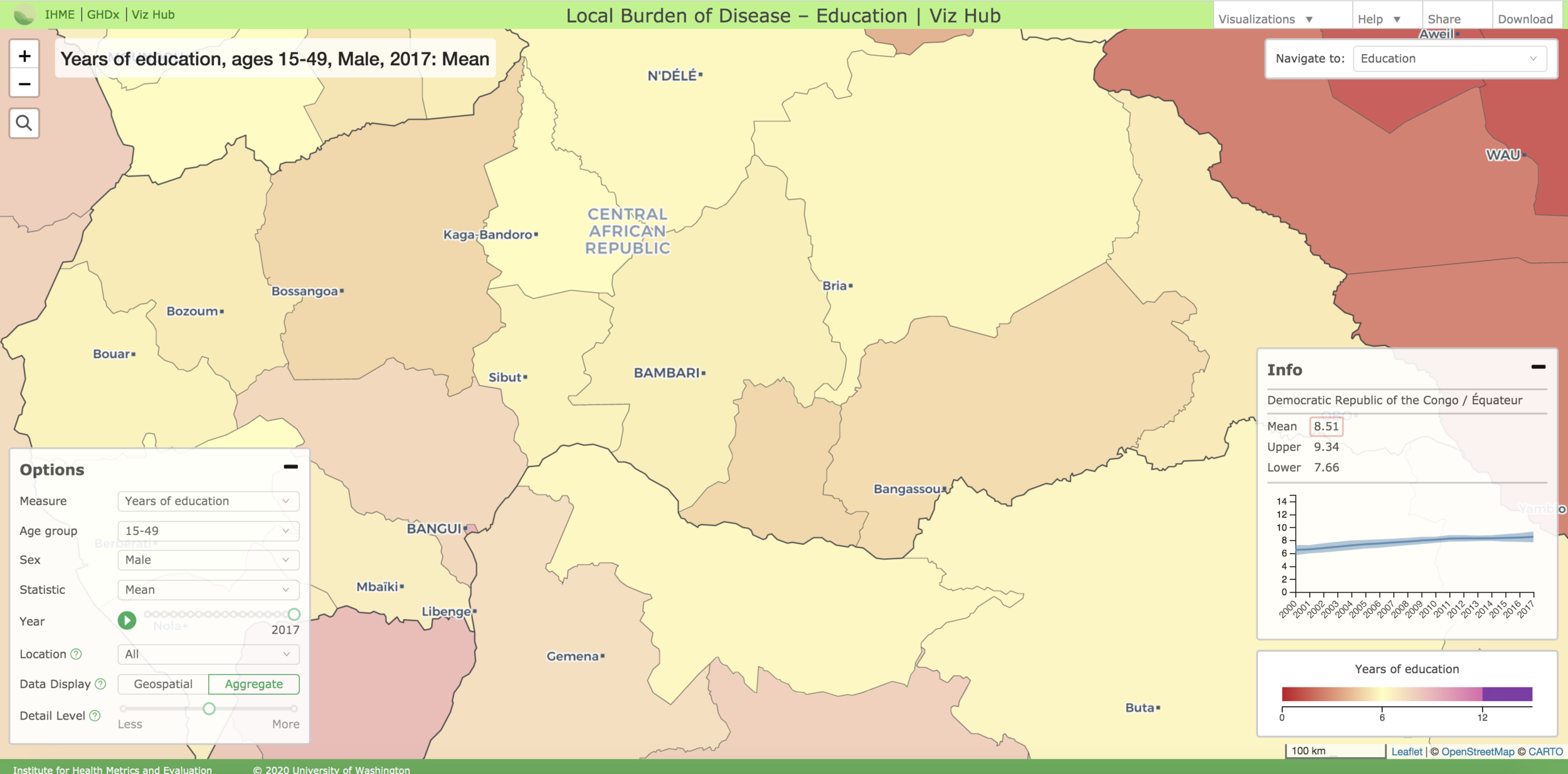
In 2017, the global health organization IHME - the Institute for Health Metrics and Evaluation - launched the Local Burden of Disease tool (LBD) as part of an academic report on precision public health. The tool functions as an interactive map visualization that plots various health indicators such as under-5 mortality and viral hemorrhagic fever on a five-by five kilometer scale. The tool offers a more granular representation of health data compared traditional aggregate visualizations, making it extremely useful for global health professionals.
IHME partnered with my capstone group from the University of Washington’s Human Centered Design & Engineering undergraduate program to understand what parts of the tool could be improved to increase uptake and ensure that it is useful for targeted users, specifically global health professionals at the Washington Global Health Alliance (WGHA) and the Bill & Melinda Gates Foundation (BMGF). The project took place from January 2018 to June 2018 and culminated with a final presentation to IHME stakeholders and the organizations great team, as well as a handoff of mocks and process documentation.
Team
Wil Sanctis | UX Designer & PM
Molly Donohue | Front End Developer & UX Designer
Noah Eisfelder | UX/Visual Designer
Glossary
GHDx
Global Health Data Exchange. IHME’s catalog of surveys, censuses, vital statistics, and other health-related data
Themes
IHME refers to different health topics available in the LBD tool as “themes”. Examples include under-five mortality, child growth failure, and specific infectious diseases (Ebola virus disease, Marburg virus disease, Lassa fever, and Crimean-Congo hemorrhagic fever)
Visualization
A state of the LBD Tool that contains data on a specific topic, or “theme” (defined above).
LBD
The Local Burden of Disease visualization tool provides maps broken into five by five kilometer estimates about certain health topics, the maps can be customized to show only certain time periods, and have three different options for level of border detail (Country, State, or District)
GBD
The Global Burden of Disease represents a suite of different visualizations that allow users to compare causes of death across the world, at an aggregate (not 5 by 5 kilometer scale)
Indicators
A health indicator is a measure designed to summarize information about a given priority topic in population health or health system performance.
Problem
After familiarizing ourselves with the public health space, meeting with IHME stakeholders, and preliminary research of the LBD we developed a problem statement for the project:
How can we increase uptake of the Local Burden of Disease tool, and ensure that it meets the needs of users at the Washington Global Health Alliance and Bill & Melinda Gates Foundation?
Research
The first phase of our project was dedicated to conducting research to understand the problem space, familiarize ourselves with the Local Burden of Disease, and develop a clear profile on the users and what their processes with health data are. To accomplish this, we broke our research phase into multiple steps and deliverables. The first step was a literature review of sources that describe best practices for measuring and designing effective data visualizations. The insight gained from that was then used as the foundation for putting together our two focus group sessions with users from WGHA and BMGF.
After the focus groups, we analyzed our notes via affinity diagramming to piece together our personas and journey maps. The personas captured the motivations and context of our users, while the journey maps showcased their process for working with health data. Finally, we used our focus group research to identify various issues within the LBD tool that were relevant to our personas. As a group, we decided that it would be best to focus on one particular problem area for this project, so we weighted our preferred issues and then consulted our sponsor to see what they wanted us to address. In the end, we settled on making design recommendations for improving the transparency of the LBD’s source data.
Research | Focus Groups
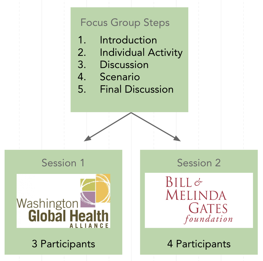
The primary piece of our research phase came in the form of two focus group studies, one with participants from the Washington Global Health Alliance, and the other with participants from the Bill & Melinda Gates Foundation. While we initially thought that individual usability tests would have been a helpful first assessment of the tool, focus groups were better suited for the situation given the lack of availability of people at the two organizations, and considering the fact that the LBD can be a collaborative tool. Additionally, usabilities studies would likely not give us the high level summary of process users have for working with health data.
We prepared our focus groups to be made up of five steps: Introduction, Individual Activity, Discussion, Scenario, and Final Discussion. These steps would allow us to see if the current navigation and information tool align with their expectations, and learn about specific user pain points in the LBD.
Focus Group Challenges
During our first focus group study with participants from WGHA we ran into an unexpected challenge, none of the participants had any experience using the Local Burden of Disease tool. The next day at BMGF we had a similar outcome, with half of our participants having never used the tool, and the other half having very little experience. This caused us to realize that while IHME had launched the LBD tool with an idea of who could use the tool, there were no clearly defined users.
As such, we shifted the approach of our project to designing for potential users of the tool. We also made changes during our focus group sessions to try and get a higher-level understanding of how these potential users make use of health data, and where in their process the LBD tool could fit in.
Affinity Diagramming
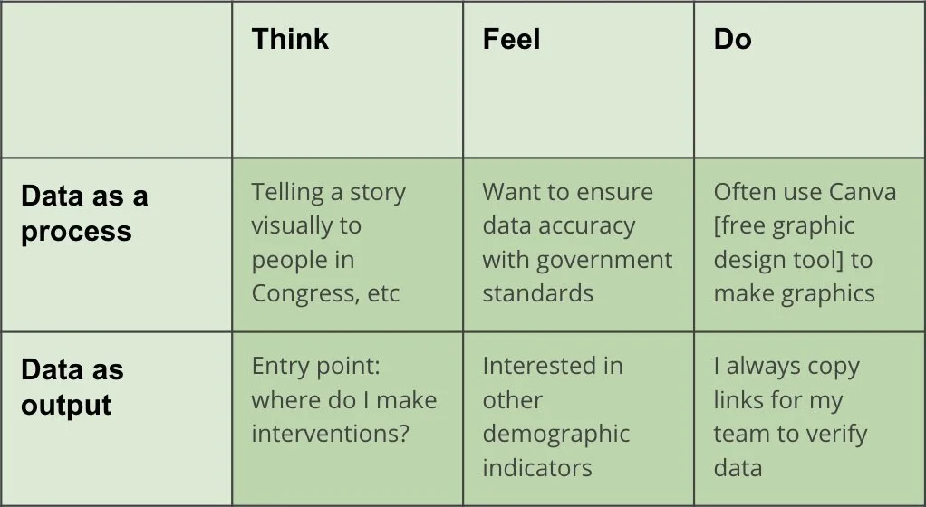
To generate findings from the notes and recordings of our focus groups we employed an affinity diagramming process. As part of this we wrote down interesting quotes and notes regarding our participants, and then sorted them according to several different frameworks including a Think, Feel, Do structure to create our personas, and a steps-based structure to understand users’ processes. In the end, we saw to distinct types of potential users, those who use health data as a process, and those who use it as an output.
Research | Personas & journey Maps
For the research phase of our project we created two deliverables, personas and users flows. After our affinity diagramming, we made two of each deliverable to reflect the two user processes that emerged, data as a process and data as output.
Data as a Process
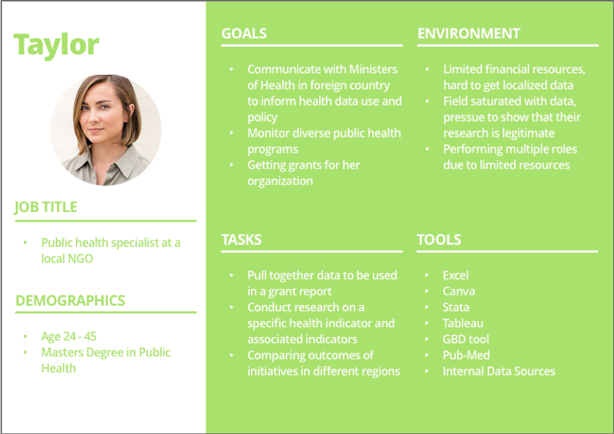
The Taylor persona might use the LBD tool to track malaria over time in northern Ghana, as part of a larger research effort to get funding for a new vaccine clinic in the region.
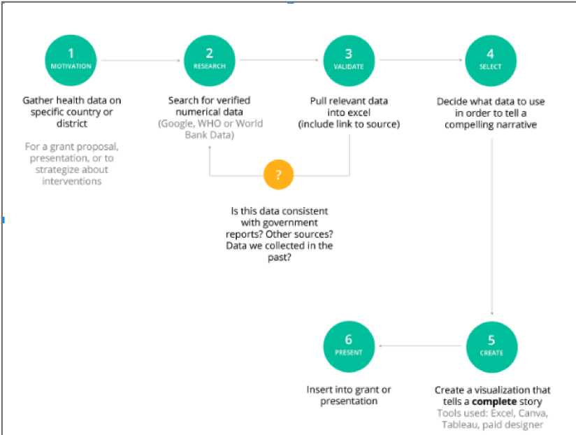
This map represents data as a process. It captures steps like collecting data, sorting it in a software, verifying it’s accuracy, and producing a custom visualization. This would be the journey of the Taylor persona.
Data as Output
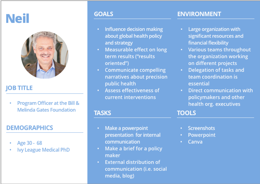
The Neil persona would take a screenshot of an LBD visualization and incorporate it into his slide deck, as part of a presentation to policymakers on how to combat viral hemorrhagic fever.
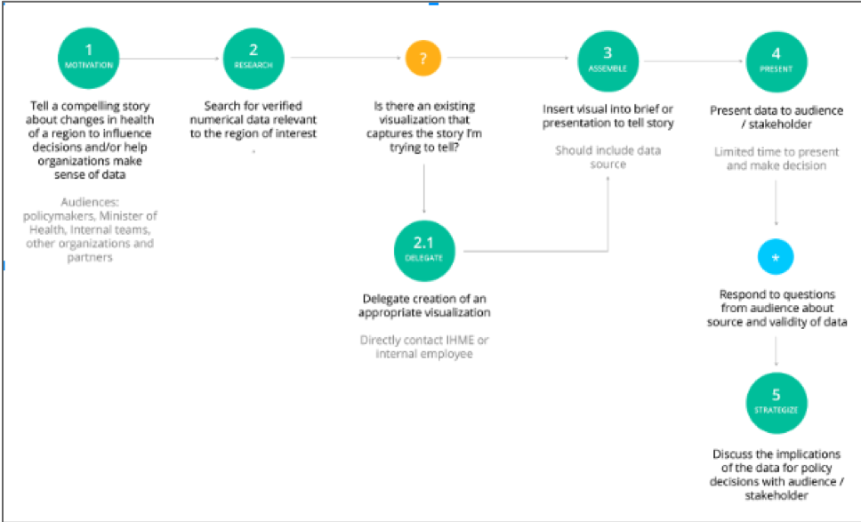
This map represents data as output. This process is about looking for data and visualizations that aid or support a narrative. The Neil persona would take these steps of finding an easily created visualization and making note of where it came from.
Defining Project Scope
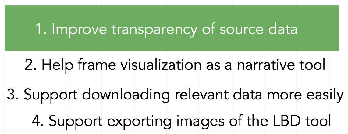
These initial deliverables helped the team to gain key insights into what type of global health professionals could benefit from the LBD tool. The work also led us to several key findings about problems with the tool that we could design for. The four major problem findings are listed to the right. Given the short time frame of the project, the team and our sponsor agreed that it would be best to design improvements for one of these problem areas. To determine which one to focus on, we did some very brief design ideation for each, and then ranked our individual preferences and consulted with our sponsor.
We decided on improving the transparency of the LBD’s source data. Specifically, we wanted to improve the ease and efficiency with which users could see what source documents power the tool. This problem was a key pain point for both our Taylor and Neil personas, as they both need to be able to quickly validate and verify the data they are working with. Further, several of our participants expressed concern over the fact that they did not know how exactly the LBD visualizations were created.
Design
With our problem space identified and our journey maps and personas defined, the team moved into the second phase of our project, design. This phase consisted of several steps, including ideation, individual wireframing, peer critique, and then final high-fidelity wireframing and prototyping. The goal of this approach was to first establish which parts of the LBD tool we want to redesign or enhance, and then go off individually and explore potential solutions. We could then come back together and decide which solutions we wanted move forward with prototyping. The prototype would then be used in the third phase, evaluation, as a way to assess the effectiveness of the designs.
Ideation
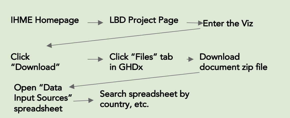
The early ideation of our designs was made up of two steps, research of the current system and whiteboarding. In researching the current system, we found that most of the source data information potential users are looking for is actually available in the GHDx tool, but it is a long and arduous process to access what they need - and it is not directly linked to the tool. A summary of that journey map is below. In whiteboarding, we made several high-level design decisions at a very low fidelity. This gave us an opportunity to quickly explore and decide on how we wanted to better surface the LBD’s source data documents.
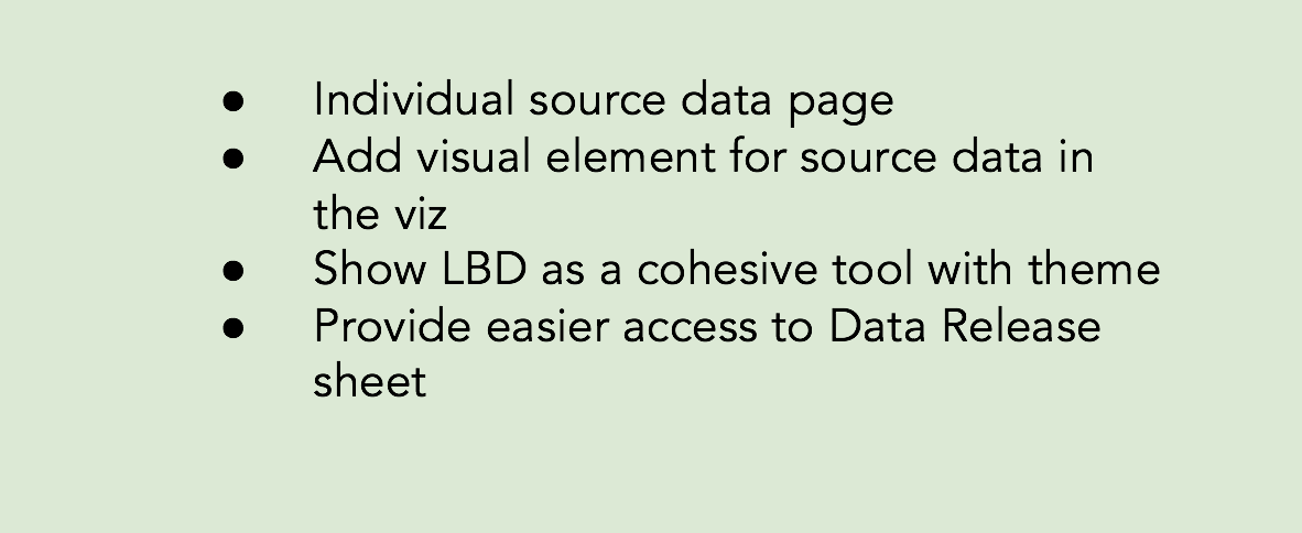
Whiteboarding High-Level Design Ideas
System Research Finding: Original Way of Accessing Sources
Final Critique and V1 Designs
With our ideation complete, we individually mocked up wireframes of the design ideas we had decided on. We each then presented our wireframes to the two other team members for review and critique. After everyone presented, we deliberated and selected the designs we thought were best. In this critique we emphasized keeping our designs simple - as our literature review suggested. And we also consistently referenced our personas and user flows to ensure that the designs would make validating sources easy in each of the processes for our potential users. After critique, the selected designs were refined and pieced together in an interactive prototype.
V1 Design Highlights


Evaluation
For the final phase of our project, we ran five usability tests with the prototype of our designs for improving the transparency of the LBD’s source data. This was an essential step in our process because we informed our sponsor that we would deliver actionable design recommendations for the LBD, meaning our V1 designs had to be put in front of users and modified before we could hand them over. As such, we developed a list of five research questions we hoped to answer regarding our designs, and then wrote up a script for running the usability test. All of the tests were based on a scenario involving accessing the LBD’s source data. The scenario was applicable to aspects of both the data as a process persona and data as output persona.
After all of the tests, we synthesized our findings and iterated on our designs based on the feedback. We also made slight tweaks to the designs in between usability tests. Additionally, we met with a software engineer from IHME to confirm that all of our design ideas were feasible to implement.
Usability Test Overview
Research Questions:
Can LBD users effectively understand what source data is going into each visualization?
Can LBD users understand how estimates and source data are used to create LBD visualizations at a sufficient detail to complete their work?
Can LBD users find desired information on the IHME site to answer questions they have regarding source data?
Can users understand the relationship between the LBD Tool and the individual visualizations well enough to quickly enter the visualization they are interested in?
Participants:
5 total participants from various global health data organizations including Path, Possible, and Adara. Participants matched both the Neil and Taylor personas.
Scenario:
“A nonprofit organization you’re working with is trying to improve the health of communities in Cameroon. You’d like to understand more about mortality rates for children under 5 years of age in Cameroon. You are using this tool to get an idea of the trends of Under-5 mortality in this country. You’ll be giving an external presentation on what you learn to leaders of the organization to help them plan future initiatives surrounding maternal health and nutrition.”
Usability Test Results
All of the participants were able to successfully complete the scenario without any major problems or dead ends. There were some slight issues given that they were using our prototype and not a fully functioning iteration of the system, but these were easily resolved. The overall feedback to our designs was positive, as participants appreciated a source data page that was directly connected to the LBD tool. Additionally, we came away with several updates to the usability and structure of our design based off some of the quantitative data we collected from our participants. The major changes we made based off of these findings are detailed below.
Create a more condensed version of “Summary Estimation”, so the source list sits above the fold.
Several participants missed the source list entirely when clicking through to the source data page because the original description feature took up too much space
Make the Table View the default setting for the source list
Three participants preferred to search through the source list when it was on the table view as opposed to the card view. This made it “easier to scan” and made filtering more intuitive.
Insert explanatory tooltips on hover for various terms and buttons in the source data list
Multiple participants expressed confusion over what certain terms meant and whether or not they related to specific visualizations. E.g. Thinking sources tagged “neonatal” are not in the Under-5 dataset, when in fact they are.
Disclaimer about LBD approximations should be separate from the copied citations portion of the “Cite” feature.
Most participants ignored the disclaimer about LBD data points being approximations when it was surfaced in the copy-text box. By moving it outside of the box and highlighting it, it is far more clear.
LBD landing page should feature the themes in a vertical tab style list.
As more themes get added vertical tabs will make it easier to scan through all of the different visualizations that are apart of the single LBD tool. One participant also struggled to see the connection between what was in the box and the horizontal tabs.
Design Recommendations
Having completed the research, design, and evaluation phases of our project, we were able to present actionable design recommendations for improving the Local Burden of Disease tool. After establishing the context of our users and focusing in on a particular problem, we developed designs that make it easier to access the source data documents behind the geospatial data points, present the LBD as a cohesive tool, and explain how exactly the visualizations are produced.
All of these improvements will help the Taylor and Neil personas - data as a process and data as an output respectively - make use of the LBD tool in their daily work. For Taylor, it is highly important that she be able to download her data sources and see what particular documents went into the research she is doing. For Neil, citing sources and being able to confidently reference and explain the LBD tool are crucial when presenting his material.
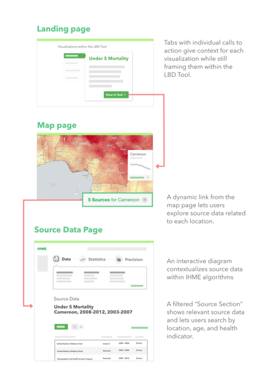
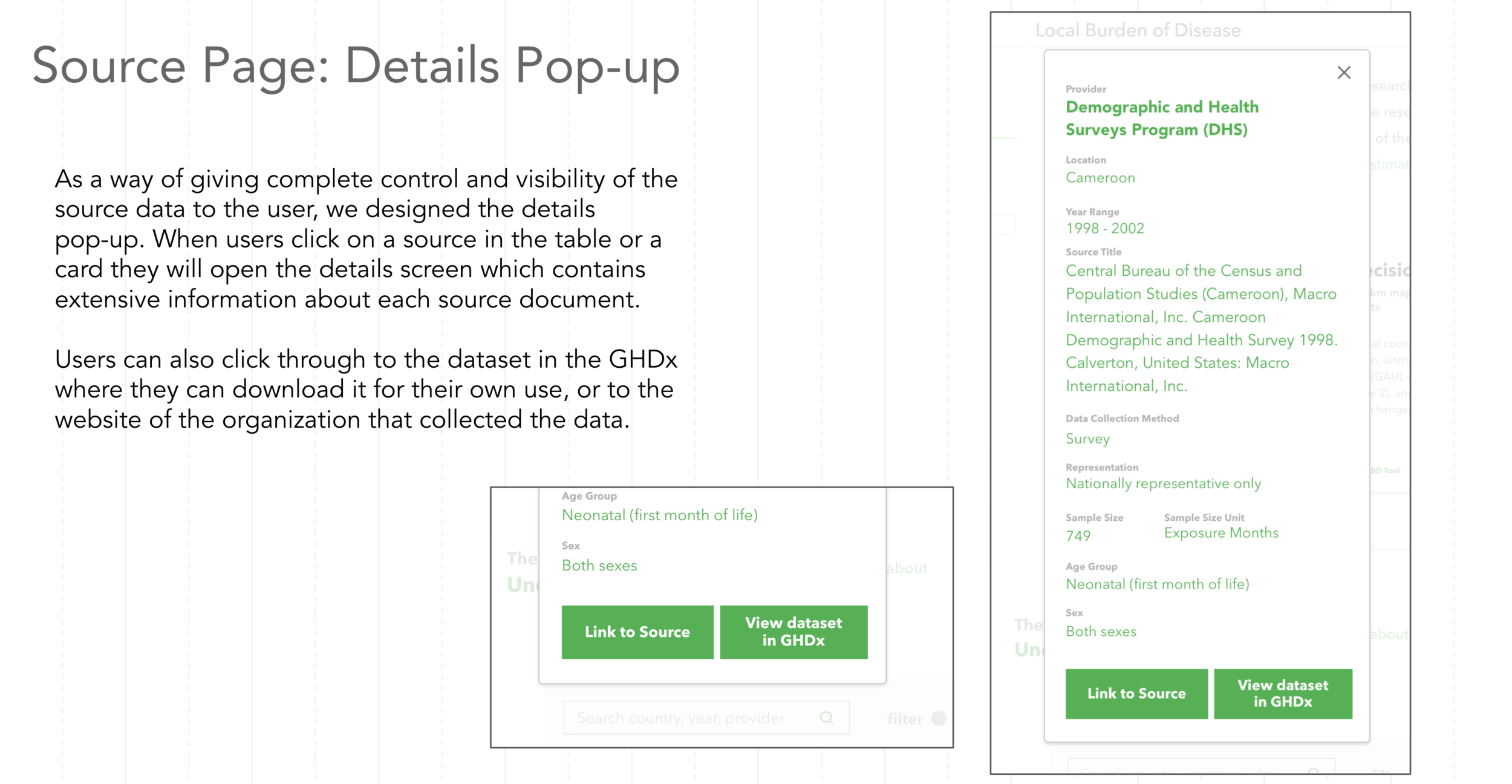
There were three primary screens on which our design recommendations should be implemented, the LBD landing page, within the LBD visualization itself, and a new source data page. The following annotated mockups detail the specifics of our recommendations.
Additionally, you can find our Evaluation Framework here. The goal of the framework is to serve as a reference for the design, copywriting, and navigation structure of future IHME visualizations. The framework should simplify the process of assessing a visualizations’ usability by functioning as a guide to best practices for the current user profiles we have defined and potential new users.


Reflection
When we began the planning stage of our work with IHME, I had a strong vision for how I thought the project would go, and what I thought our final design recommendations were going to be. However, when spring quarter arrived and the project got going, my vision quickly dissolved. I had anticipated that we go through the motions of user-centered design and then end up with a few usability updates for the Local Burden of Disease tool. What I did not see coming were the challenges and opportunities that are part of applying human centered design to an existing system that is complicated and somewhat entrenched in its origins.
Most of the work we tackle in the HCDE curriculum involves designing new solutions for problems that are lacking technological infrastructure. Take for example, my HCDE 451 final project WhoUP - which was a mobile application for keeping up with events on campus and engaging with fellow students. There are certainly applications that do similar things, but I conducted research and design practices that were for a new solution, and I did not have to worry about an existing interface or a large and diverse group of stakeholders.
Working on the Local Burden of Disease was a far different situation. Given that it had been launched as part of an academic publication, it was an extremely powerful tool with a robust user interface, but no real users. And while this is not a dire problem in design, our capstone team did not find this out until we were in a room running a focus group with people we thought were users. It would have been great to know the lack of user base in the planning phase of our project because we could have scoped the early steps of the project differently. Instead we had to adapt on the fly and figure out how we could modify our focus groups to define potential users. That being said, I do not blame IHME for not conveying this issue to us, they are global health professionals, and their expertise is in improving people’s health through effective intervention, not building personas and journey maps. In the future, I will have to be more prepared for problem spaces and users to be less clear cut.
Another major hurdle for the team came during our focus group at the Bill & Melinda Gates Foundation. One of our participants in that session was the foundation’s resident UX expert. After the session she pulled our group aside and asked if she could give us some tips for moving forward. We happily welcomed the input, but she went on to tear into us and claim that our session was useless. She even questioned our basic understanding of what user-centered design is. This was just a day after we found out the LBD tool has no users, so understandably we were pretty shaken. At that point we questioned whether we were even capable of finishing the project. Eventually, we spoke to the instructors in the Capstone course and to our IHME sponsors and they were both supportive of the work we had done, explaining that we were in fact, on track. Overall, it was a pretty shocking interaction, but it helped me realize that there is no hand holding in the professional setting. People will challenge you and always question your work, so you have to be your biggest advocate, be ready to defend you decisions, and trust in your own capability.
Looking back on the work we did, I do not believe there is anything major that we should have changed. However, I would appreciate the opportunity to explore design solutions for some of the other problem spaces we identified. I feel like designing to show the narrative power of the tool, and making exporting visualizations easier are all crucial parts of our potential users’ processes. I also think that the solutions for those problems would compliment the design recommendations that we have already put forward.

