VICE Video
VICE
vice video redesign
In June of 2017 I joined VICE Media’s technology team as their first ever Product & Engineering intern. As a longtime fan of VICE journalism and a regular viewer of their cutting-edge documentary videos, I was extremely excited to be joining a company where I could apply my knowledge of the user-centered design process to help build the digital platform for media content I believed in. Upon my arrival to VICE Tech, the team had just completed a yearlong unification effort. As part of this undertaking the backend of all the websites for the various VICE verticals (e.g. Noisey, Munchies, etc.) were converted to a single codebase, and a single frontend UI structure was adopted across the sites to create a consistent user experience that could still allow each vertical to maintain its unique branding identity.
As the newest member of the team, I spent my first week completing a thorough UX assessment of this latest iteration of the VICE digital platform. I went on to present my findings to my design colleagues and then worked with them to figure out which specific problems I would tackle during the duration of my internship.
Below you will find images of my design solutions and a description of my process for the problems that I ended up focusing on.
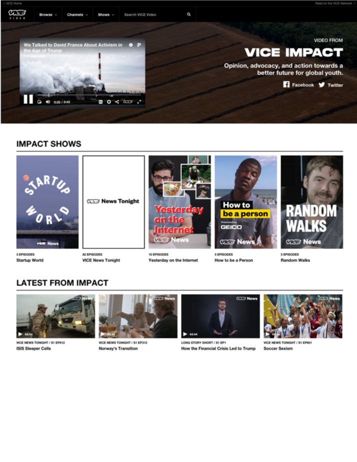
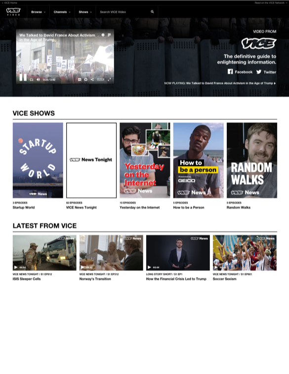
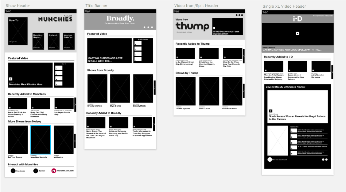
One of my primary projects was to improve the layout and interactions on each verticals’ channel page on the VICE Video site. The VICE Video site is the part of the VICE digital platform where users can watch all of the videos from each of VICE’s verticals and browse different VICE shows. The channel pages are essentially micro-homepages for all of the videos and shows that exist within a specific vertical.
Problem
There were several major issues with the original version of the channel pages. Including:
Large videos containers and queue menu that do not fit within the dark grey backdrop
Vertical taglines are difficult to read and social buttons appear to be floating on their own
Lack of branding that demonstrates to users the unique style of each vertical and conveys that all of the content on this page belongs to a single vertical
Various entry points - including the “Channels” dropdown in the navigation bar - to these pages that make it challenging for users to determine where they are on the VICE Video site and VICE digital platform as a whole
sTakeholder requirements
There needs to be an autoplaying video on the page
The carousel structure below the page cannot change
Use copy to show users what they are looking at
PRocess
Competitive Research
Early Brainstorming
Assessing stakeholder requirements
Iteration & Refinement
Solution
I developed a simple banner-style solution that leverages consolidated text with a clear hierarchy and branded images (consistent with VICE’s use of striking photography across digital and print content).